
Office Practicum Branding
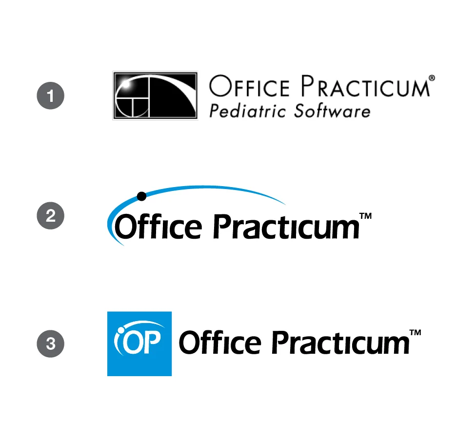
Branding the new Office Practicum logo was a task that I could not wait to do when I started working at this company back in 2011. When I started they had the top logo in the example to the right (1). It was a version of the Fibonacci spiral, and did not have many useful applications as it sat.
In 2013 the managers all agreed that it was time to get the logo updated, to match a new style of printed materials that we were using. After a while of back and forth, we settled on the second logo on the right (2). This logo was in use for a few months, until I had to come up with a logo for our iOS application.
When I came up with the square icon that is in the bottom and current logo (3), for the iOS application, the managers all really liked the concept of dropping the swoosh over the whole logo and using a combination of the square, and custom typeface. This new logo also started the basis of using color blocks in our design pieces, and can be seen throughout all of our branding materials.
Example of Office Practicum branding and overall look on homepage.
Example of Office Practicum branding on stationery.